Using Font Awesome 5 🏳️ in React

Hi, I am Adyasha Mohanty, a self taught developer extraordinaire from India. I am passionate about bringing ideas to life from the ground up whether that’s crafting beautiful or building intuitive user interfaces. Beyond coding, I thrive on sharing knowledge, engaging with the tech community and helping others grow. I love the entire journey of creation from the first line of code to shipping polished, user ready products. Let’s build, learn and ship amazing things together. 🚀
The Font Awesome went all out with new version 5 adding a wide variety of SVG icons and providing users with new features🤩.
If you’ve worked with Font Awesome in the past, something like fa-profile might look familiar. Font Awesome introduced icon styles like fas for Font Awesome solid, fal for Font Awesome Light, etc. This adds a great deal of flexibility for UI/UX design.

Moreover, there are Font Awesome packages (like the one we're going to use!) for React, Angular, and Vue 😮.
Installation
To get started, we’re going to install react-fontawesome along with their libraries.
// If you are using npm:
$ npm install @fortawesome/react-fontawesome @fortawesome/fontawesome-svg-core @fortawesome/free-solid-svg-icons

// or, using Yarn:
$ yarn add @fortawesome/react-fontawesome @fortawesome/fontawesome-svg-core @fortawesome/free-solid-svg-icons
The packages we're introducing just contain the free version 🆓. If you’re looking to utilize new pro icons and styles, look at their site for additional installation and setup directions.

Implementation
Let's move forward to implement these beautiful icons 👌 throughout our app.
There are numerous approaches to utilize these symbols however we will going to focus on building a library to effortlessly get to all symbols.
The following code to add icons to the library can be done at a root level of our application i.e App.js. We’ll start by importing the required files and calling fontawesome-svg-core’s library.add to pull our icons.
//App.js

import { library } from "@fortawesome/fontawesome-svg-core";
import { faCheckSquare, faMugHot } from "@fortawesome/free-solid-svg-icons";

library.add( faCheckSquare, faMugHot);

//...
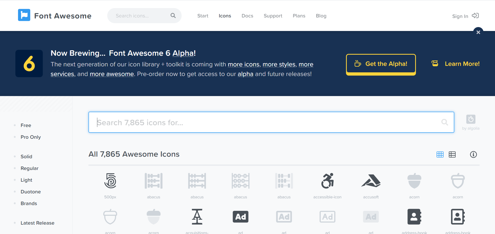
All icons can be found in Font Awesome’s icon library.
We have successfully added the icons we need. Now it's time to implement it in our component 👍. Imagine that we have a component called Icon.js. Since they are already been added to our library in App.js we just need to import this:
// Icon.js

import React from 'react'
import { FontAwesomeIcon } from '@fortawesome/react-fontawesome'

export const Drink = () => (
    <div className="App">
      <div>
       <FontAwesomeIcon icon="check-square" />
       Drink: <FontAwesomeIcon icon="mug-hot" />
      </div>
    </div>
)
By adding faCheckSquare and faMugHot to the library, we can refer to them throughout the app using their icon string names check-square and mug-hot (in lowercase letters).

Wait 🤔, I think our icons and text are a little squished and, might I venture to say, boring, so let’s add a space between the icon and the text and change the icon’s color and size :
<FontAwesomeIcon icon="check-square" />{' '}
Drink: <FontAwesomeIcon icon="mug-hot" color="pink" size="2x" />
As you can see, the FontAwesomeIcon component can take a few different props to change the icon style. Here we used the color and size props. The size prop expects a string value like xs, lg, 2x, 3x and so on 😃. There are quite a few more props that can be passed-in. Notably, the rotation and pulse boolean props will have the icon rotate on itself.

Note: Don't use the CDN link of FontAwesome in your index.html file. It will decrease the performance of your site.
Conclusion
That's all. Hurray🎉, you did it. The process is pretty straight-forward but you can easily implement this in your app. Do give it a try, you will definitely love it 😍.
Thanks for Reading! Have a great day :)
Find me on Twitter @Adyasha8105👀. This post is also posted on my blog page.


